My honest evaluation: I don't think it's too good, except for the sword. No offense.
Hmmm... I had actually thought it turned out rather well. Ah, whatever. It is actually not quite symmetrical, even. Anyway, no offence taken. I tried, though admittedly it was a quick try. I'm not much of an artist anyway most especially in this style - I'm actually surprised that people like the weapons I've drawn - and only draw to back up writing, for the most part.
(Oh, by the way, the sword in the picture is actually terrible. The blade is not even symmetric, and the hilt above the crossguard looks horrible.)
I think it's okay, although I sense that you can do better.
Not in this style I couldn't - that is, I wager, the best I could do. As I said, I don't much like such anime style as it is, and by preference would rather draw more realistic pictures, like the painting in my sig. Relatively, I did it extremely quickly, too, so that might account for it. I wouldn't bother trying again, though. It was just a thing that came into my head the other day to try.
The other characters already have artworks but I believe Glenn's design should either match the Dragon Ball style of the others (not a very neat idea) or the others should be redrawn with the less anime style (good idea).
Well, I tried to match the style as best I could - I did try to keep the colours the same, for comparison:

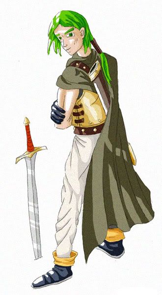
as close as a green as I could get. But especially faces in it are terribly hard for me to do. Anybody that actually knows and likes anime willing to do try? I'll just stick to the weaponry. That's a measure easier.


