Difference between revisions of "Items Icon (CTP)"
From Chrono Compendium
| (2 intermediate revisions by one user not shown) | |||
| Line 1: | Line 1: | ||
==General Information== | ==General Information== | ||
| − | The items icon is a cube in the Prerelease, rather than a box reading ITEMS. | + | The items icon is a cube in the Prerelease, rather than a box reading ITEMS. Also, the color palettes for the various schemes are slightly different. The option menu is quite different at this point. Among the changes... |
| + | |||
| + | * Three options are missing: "Battle Cursor Memory", "Item/Tech Cursor Memory", and "Item/Tech Descriptions". The icon for the "Menu Cursor Memory" option was also changed from a finger in the prototype, to a small menu graphic in the final. | ||
| + | * The left side of the menu was narrower, and the options were arranged in a single row of seven, instead of two rows of five. | ||
| + | * There is only a single "battle speed" option in the prototype, which appears to control both the messages ''and'' gauge. This was broken into two separate options in the final. | ||
| + | * The background color/pattern option was moved to the top of the menu. | ||
| + | * The ATB gauge could only be toggled on or off. There was no option for an alternate setup. | ||
==Media== | ==Media== | ||
| Line 10: | Line 16: | ||
[[Image:menu_final.png]] | [[Image:menu_final.png]] | ||
| − | + | [[Image:CTColorPalette_Pre.gif]] | |
| − | + | [[Image:CTColorPalette_Jap.gif]] | |
| + | |||
| + | [[Image:CTColorPalette_US.gif]] | ||
| + | |||
| + | ''Thanks to Jessica Ingmann'' | ||
| + | |||
| + | ''From'': [[Chrono Trigger Prerelease]] | ||
Latest revision as of 04:23, 18 February 2017
General Information
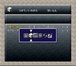
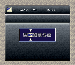
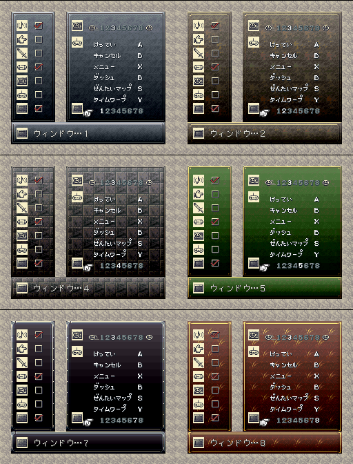
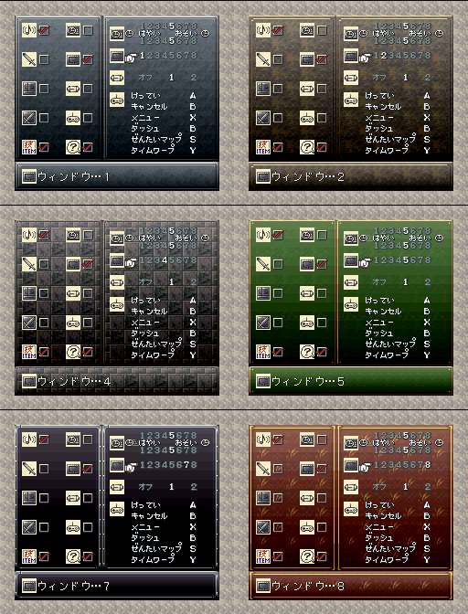
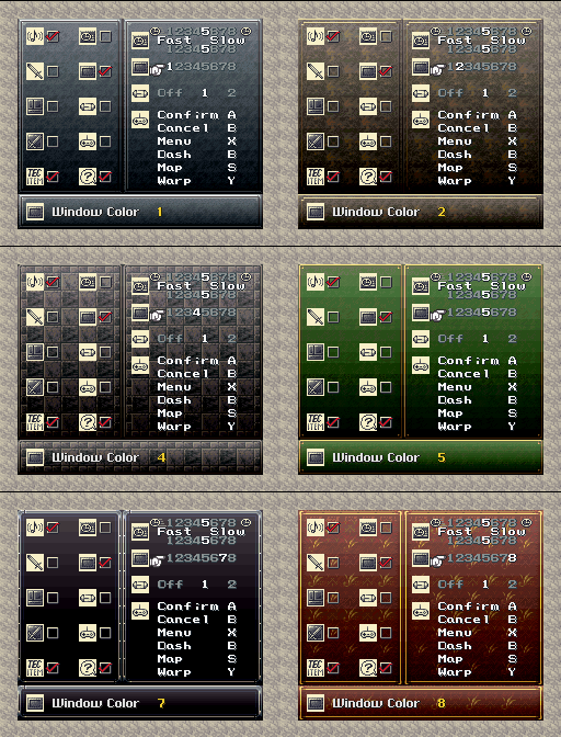
The items icon is a cube in the Prerelease, rather than a box reading ITEMS. Also, the color palettes for the various schemes are slightly different. The option menu is quite different at this point. Among the changes...
- Three options are missing: "Battle Cursor Memory", "Item/Tech Cursor Memory", and "Item/Tech Descriptions". The icon for the "Menu Cursor Memory" option was also changed from a finger in the prototype, to a small menu graphic in the final.
- The left side of the menu was narrower, and the options were arranged in a single row of seven, instead of two rows of five.
- There is only a single "battle speed" option in the prototype, which appears to control both the messages and gauge. This was broken into two separate options in the final.
- The background color/pattern option was moved to the top of the menu.
- The ATB gauge could only be toggled on or off. There was no option for an alternate setup.
Media
Images
Thanks to Jessica Ingmann
